CSS 可以根據版型給予對應的設定

在 CSS 的 Media Query 裡面,有一個設定可以直接根據版面是橫版還是直版來判斷。

orientation: landscape

橫版 或是 橫向

orientation: portrait

直版 或是 直向 或是 縱向

具體看過 w3schools 的範例之後,就會發現,
橫向就是寬大於高,例如 1920 x 1080
直向就是高大於寬,例如 1080 x 1920

用這個設定來進行版面佈局的調整

會比用不同寬度的呈現更好,當然也可以根據寬度加上直向或橫向的組合去進行更細微版型佈局的控制,這樣不同裝置上面的呈現就會更妥當。

參考連結:

fancyBox 的 Quick product view 進階修改

這幾天重新碰一下 fancyBox
發現有幾個新應用不錯

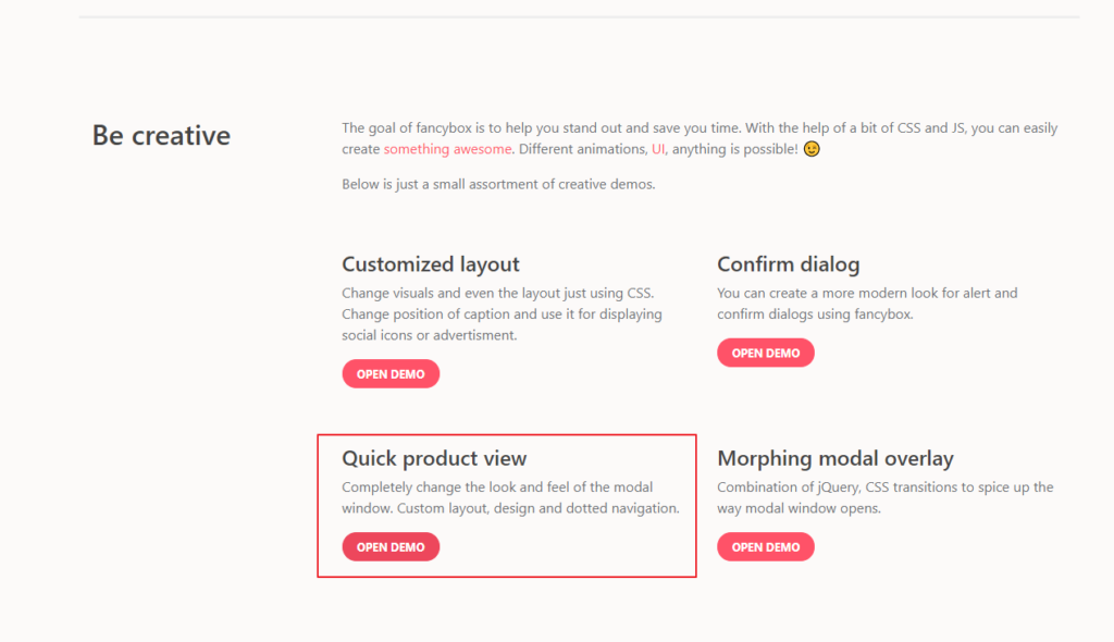
叫做 Quick product view

看 source 裡面有 codepen 的 連結

剛好這次的需求,要多一個直向與橫向的呈現要不一樣

就自己 fork 了一個 版本來貼給大家看

主要是透過CSS去調整版型

@media screen and (orientation: portrait) {
   /* Top block will contain the gallery */
   .fancybox-stage {
     height: 52%;
     background: #fff;
   }
 /* Bottom block - close button and the form */
   .fancybox-form-wrap {
     position: absolute;
     left: 40px;
     right: 40px;
     bottom: 0;
     height: 48%; 
     background: #fff;
   }
 }
 @media screen and (orientation: landscape) {
   /* Left block will contain the gallery */
   .fancybox-stage {
     width: 52%;
     background: #fff;
   }
 /* Right block - close button and the form */
   .fancybox-form-wrap {
     position: absolute;
     top: 40px;
     right: 0;
     bottom: 40px;
     width: 48%; 
     background: #fff;
   }
 }

orientation: portrait 為直向的版型,上面是圖,下面是文字

orientation: landscape 為橫向版型,左邊是圖,右邊是文字,(這個demo原來就是這樣放)

PS:

附上這個 CSS屬性的 說明與版本適用表

有興趣想知道更多版型分享也歡迎留言或是到我的TG群組發問唷

10個關於Responsive Design的提示

這10點被製作在這張圖片上面
一開始列出2010年跟2012年各地區的手機流量
接著是10點提示

  1. 保持你的版面簡單 (KEEP YOUR LAYOUT SIMPLE)
  2. 使用媒體查詢 (USE MEDIA QUERIES) + MOST FREQUENT RESOLUTIONS
  3. 定義中斷點 (DEFINE THE BREAKPOINTS)
  4. 讓你的版型更靈活 (MAKE YOUR LAYOUT FLEXIBLE)
  5. 正確呈現你的圖片 (MAKE YOUR PICTURES BEHAVE)
  6. 別忘記 MAX & MIN (DON’T FORGET MAX&MIN)
  7. 產生最好的相對性內容 (MAKE MOST THINGS RELATIVE)
  8. 當使用手機端,要線性思考設計 (WHEN MOBILE LINEARIZE)
  9. 省略非必要的內容 (SKIP THE NON ESSENTIAL CONTENT)
  10. 確認你的META VIEWPORT (CHECK YOUR META VIEWPORT)

閱讀全文 10個關於Responsive Design的提示

使用一致的社交登入按鈕【Social Buttons for Bootstrap】

剛好看到 HackMD – Markdown 協作筆記 的社交登入按鈕

五個社交平台都是一致的按鈕
就想說用『btn btn-lg btn-block btn-social btn-facebook
去搜尋一下看看會找到甚麼 【我的預設搜尋已經改為 duckduckgo.com 了】
閱讀全文 使用一致的社交登入按鈕【Social Buttons for Bootstrap】

Favicon (最愛圖示) 產生器

之前一直沒有特別注意過這個問題
關於 favicon 的設定語法,因為不同使用裝置
會有對應的使用圖示,為了滿足所有瀏覽器與裝置的需求
就問了一下Google大神 (之前有印象有favicon產生器)

Favicon Generator for all platforms: iOS, Android, PC/Mac…
http://realfavicongenerator.net/

閱讀全文 Favicon (最愛圖示) 產生器

Bootstrap v4.0 的進度【241/366】

  • 2015.08.19 – Bootstrap 4 alpha 1
  • 2015.12.08 – Bootstrap 4 alpha 2
  • 2016.07.27 – Bootstrap 4 Alpha 3

官方也有說到

The general development and release plan looks something like this:

  • A few alpha releases while things are still in flux.
  • Two beta releases after features and functionality are locked down to really test things out.
  • Two release candidates (RCs) to really test things out closer to production environments.
  • Then, the final release!

閱讀全文 Bootstrap v4.0 的進度【241/366】

使用者介面設計模式大全【208/366】

UI-Patterns.com 把 User Interface Design Pattern 分成六大類
六大分類下面還有2~4種子分類

  1. Getting input — 28
    1. Forms – 19
    2. Explaining the process – 4
    3. Community driven – 5
  2. Navigation — 25
    1. Tabs – 2
    2. Jumping in hierarchy – 6
    3. Menus – 3
    4. Content – 14
  3. Dealing with data — 11
    1. Tables – 3
    2. Formatting data – 3
    3. Images – 3
    4. Search – 2
  4. Onboarding — 9
    1. Guidance – 6
    2. Registration – 3
  5. Social — 11
    1. Reputation – 3
    2. Social interactions – 8
  6. Miscellaneous — 5
    1. Shopping – 4
    2. Increasing frequency – 1

閱讀全文 使用者介面設計模式大全【208/366】